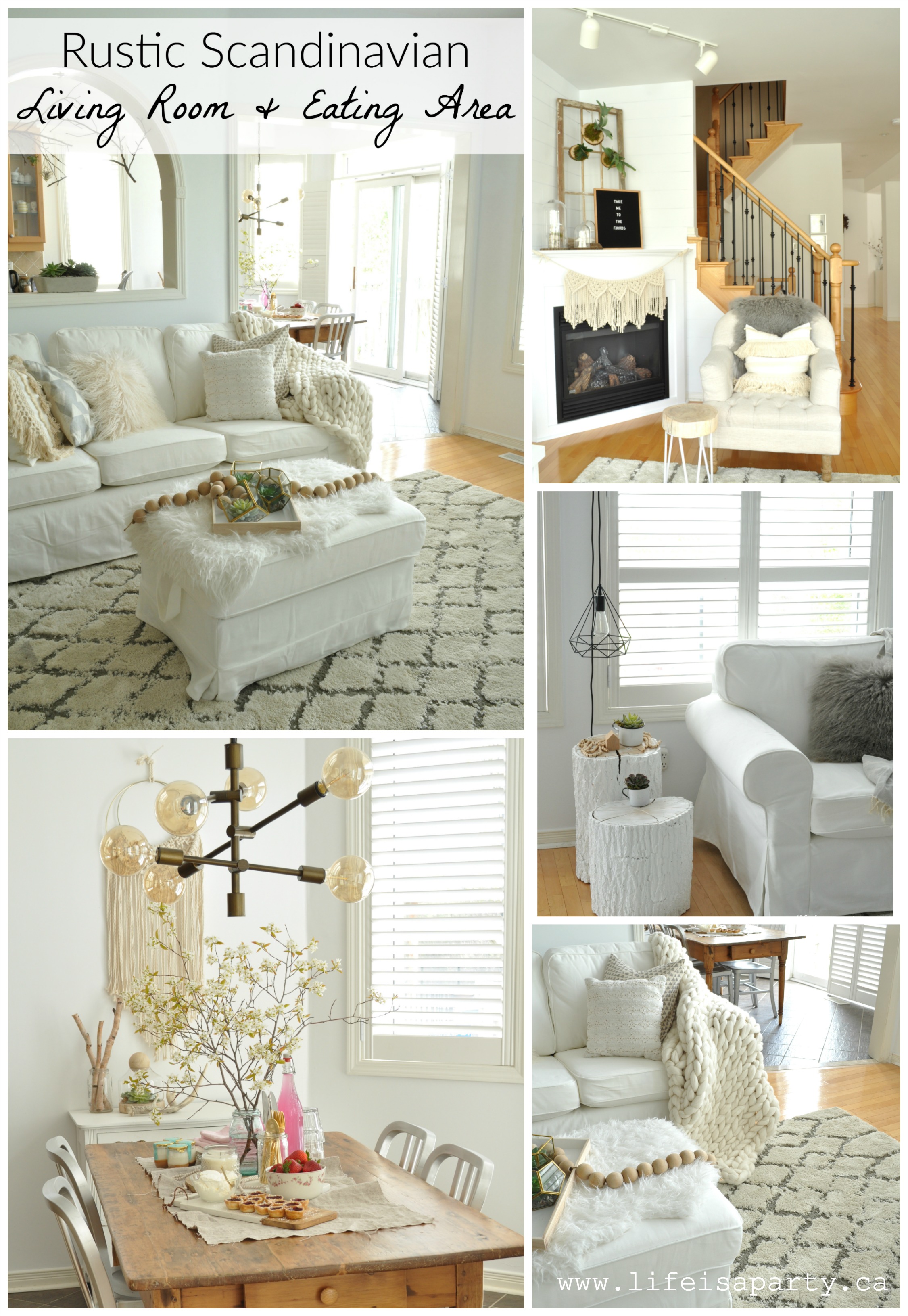
Rustic Scandinavian Living Room and Eating Area: Make over using neutrals, texture, mixing modern and rustic, natural and cozy elements -Hygge.
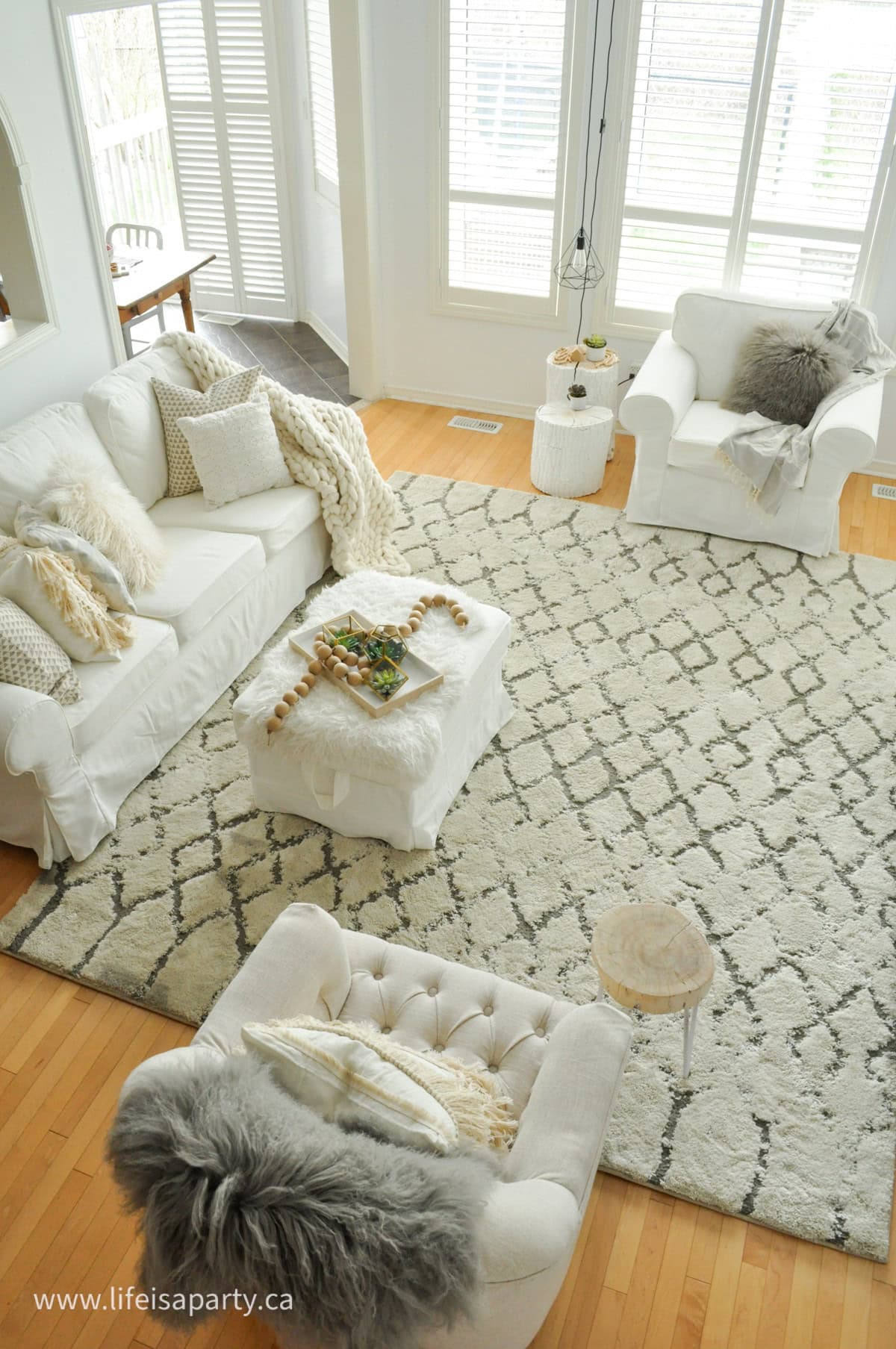
Jump to:
I’m so, so excited to share my Rustic Scandinavian Living Room and Eating Area Reveal with you today! It’s been six weeks of projects and I’m so happy with the results. I’ve been a guest participant in the One Room Challenge where bloggers take six weeks to make over one room in their homes and share weekly updates. This is the sixth and final week when everyone shares their finished rooms.
I’ve had the chance to work with some amazing sponsors and I couldn’t be happier with the results. What a change! [All the sources are linked at the bottom of the post for your convenience.]
Before:
As a reminder, here’s what the room looked like before I began.

The rooms were beige and green, with a cream shag rug and green couch. Both the eating area and the living room had been decorated about ten years ago when we first moved into the house. We were due for a new couch, and I was ready for a change.
The Dining Room Makeover
I had re-done the dining room in the last One Room Challenge and turned it from a dated contemporary look to a light, bright Rustic Scandinavian feel.

I really wanted to continue the Rustic Scandinavian look throughout the rest of the main floor.
The Inspiration
Here’s the mood board I started with six weeks ago.

I wanted to create a "Hygge" feeling, the Danish word that means "a calm comfortable time with people you love, the art of building your own cozy sanctuary, to keep oneself snug, celebrating everyday simple pleasures, coziness of soul". I was inspired by Scandinavian design to mix rustic and modern, keep things neutral with whites, greys, and real wood, add in cozy texture and elements of nature, and keep things somewhat minimal.
Progress:
In case you missed any updates you can find them all here:
DIY Shiplap Expert Tips from a Contractor
DIY Macrame and Fringe Pillows
The Reveal
I stuck pretty close to the mood board, and when I doubted myself in the middle, as sometimes happens with a major new look before everything quite comes together, I used the board and inspiration shots for guidance.

The Living Room
We started out with new paint -Para’s JoJo Whitewash and what a difference it made! The room has lots of windows but with the new white walls it feel so bright, and I love it!

We added shiplap to give this neutral room some texture and interest, and really like it. It feels rustic and modern at the same time -adding texture, but with great linear straight lines too.

Fireplace
I made over the fireplace -spraying out the brass, removing the wood decal on the front and painting it all white. What a difference, all I can say is I wish I’d done it sooner!
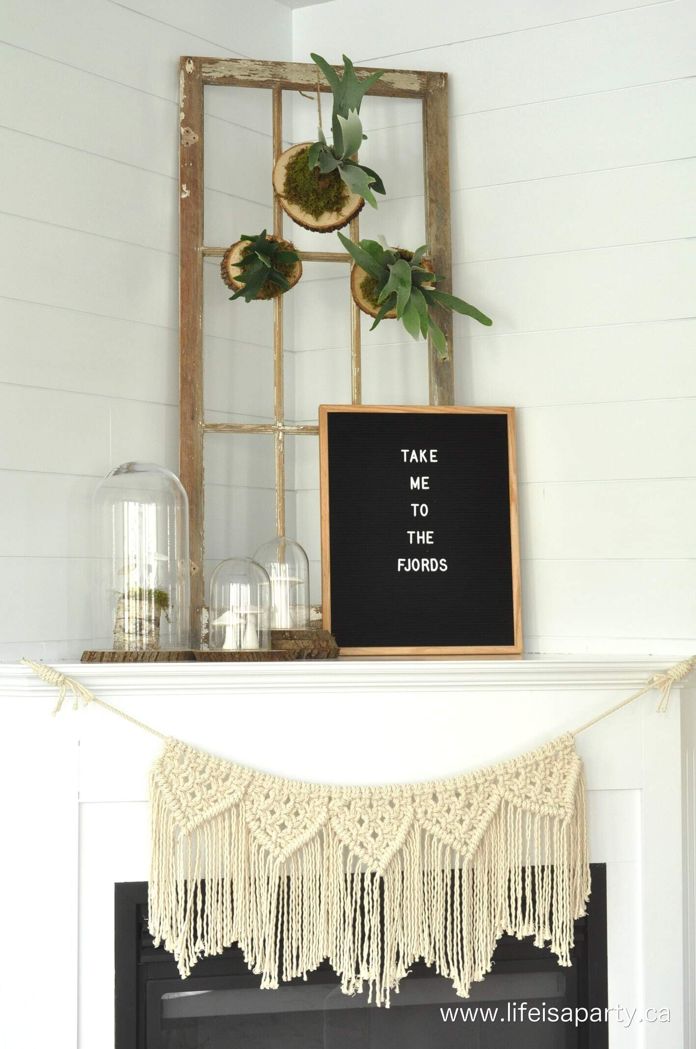
I made the pretty DIY macrame bunting garland for the front -it was surprisingly easy to make. Some of the hallmarks of Scandinavian style are simple, minimal, neutrals, and bringing nature in. On the fireplace I added three pretty stag horn ferns -tutorial on how to mount them coming soon. They’re meant to be reminiscent of deer head with their horn like fronds.

The boards they’re mounted on are from Afloral, along with the pretty glass cloches. I have a pretty collection of decorative mushrooms underneath them.

I was thankful for sunny days to photograph, but it made capturing the mushrooms a little tricky.

Also on the fireplace this amazing letter board from Letter Board Company. I love it. I’ve added a little Scandi message, but love that I can change it up all the time.

Rug
I also needed a new rug. Our old rug was from the Home Depot and lasted so, so well that it was the first place I looked for a replacement. I found this gorgeous Carlsbad Area Rug. I love that it adds a little pattern to the room, and its faded design makes it work perfectly as a rustic addition. And it's so, so soft underfoot.
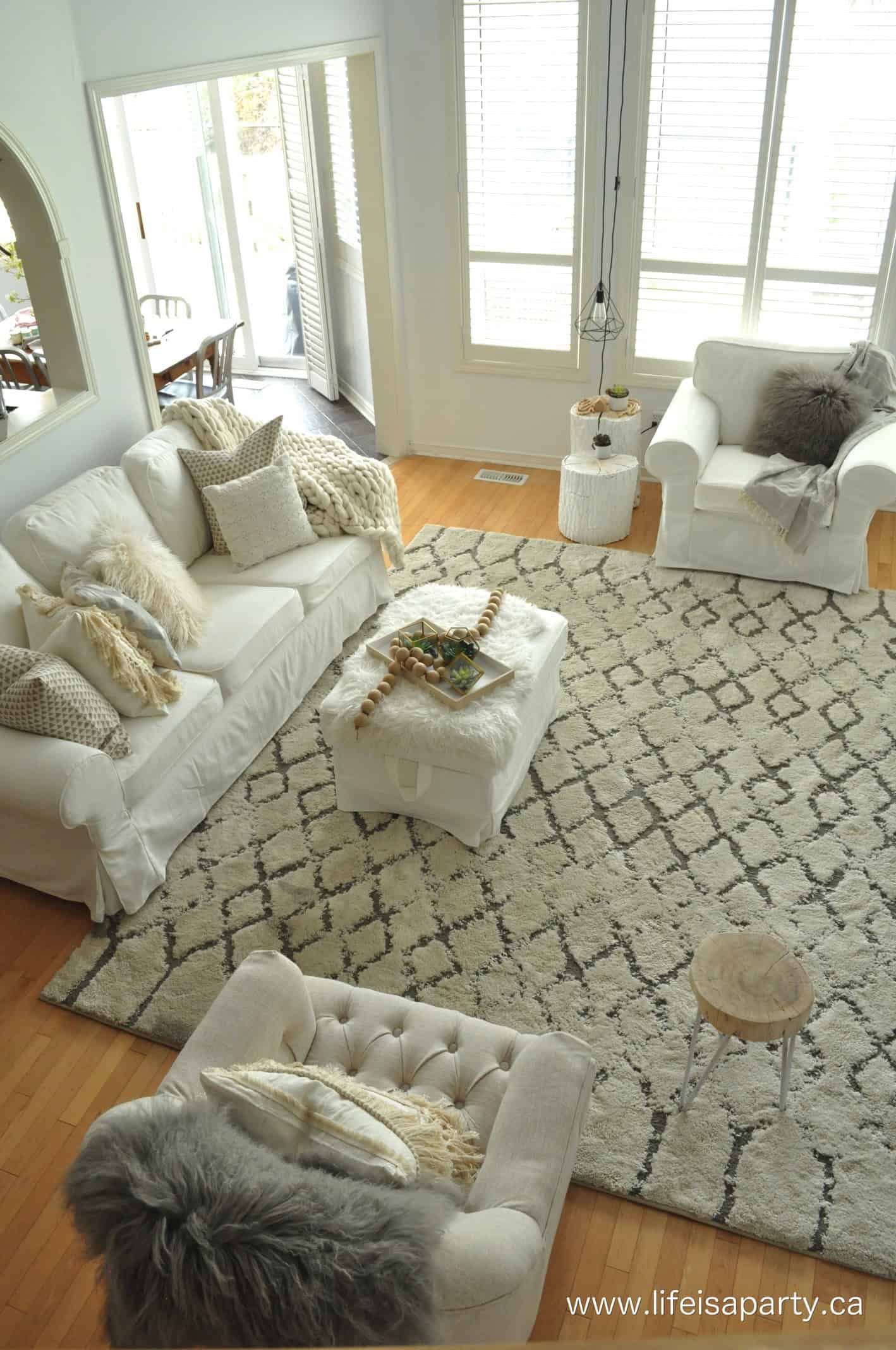
This is the pretty view when I come downstairs in the morning. I love it.

Furniture
We also needed a new couch, chair and ottoman for the room. After 16 years with our previous one, it was time for a replacement. We settled on this slip covered one, so that I could have white without the worry.

Accessories
The chunky knit wool throw on the couch is from Artizen Home -and it’s amazing! It’s so pretty, so warm, and so cozy. Everything you ever dreamed of in a throw blanket. I absolutely adore it, and the pretty texture it adds to the room.

On the ottoman are some pretty terrariums and succulents. I love the brass detail, and these gorgeous succulents are faux -so I can keep them looking this good.

I find it tricky to keep real ones looking great, so these are the perfect solution. These are so life like they’re sure to fool everyone.

Behind our couch, there is a pass through to the kitchen. I’ve added a few branches into the space, and hanging on the branches are some air plants.
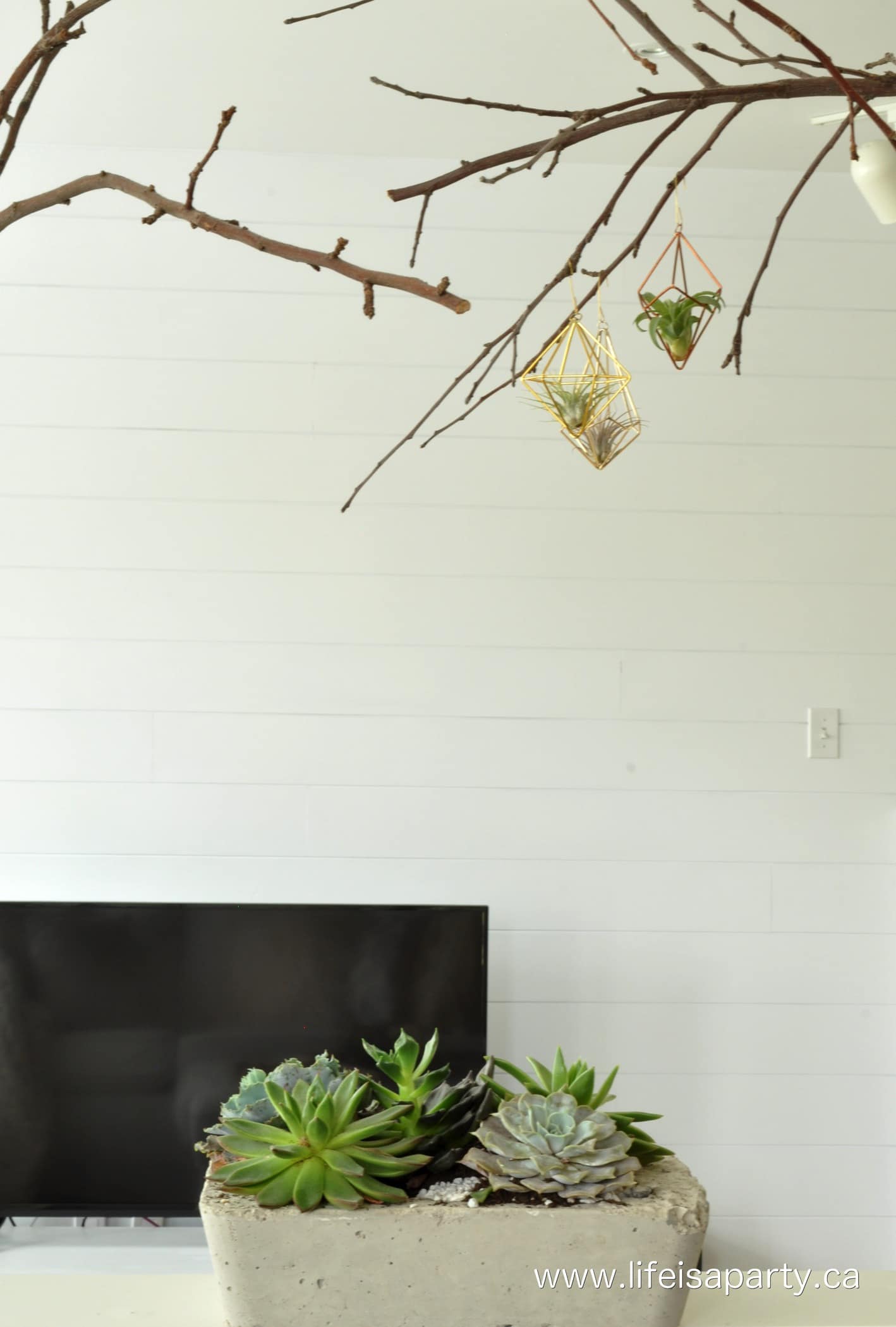
They make for a pretty view when I’m doing dishes. I’ve read they -along with the stag head ferns - need to come down and be soaked in water once a week. We’ll see how I fair with them, I think I’m holding out more hope for the faux ones.

We got a chair to match the couch, and I used my wood stump tables with them -see how I made the stump tables here.

I have to say I just love this pretty view -the shiplap and birch poles, the stumps, the light.

Another succulent to join the club.

And back on the other side of the room, the other little chair.

At the bottom of the stairs there’s the perfect spot for a little table. The pretty Scandinavian prints are from Northern Edge Prints.

I added the house shelves -they’re a classic Scandi touch.

One of the things I love about Scandinavian design is how simple it is. It leaves some room to breathe.

From the living room it’s into the eating area.
The Eating Area

What a difference changing the paint from green to white made!
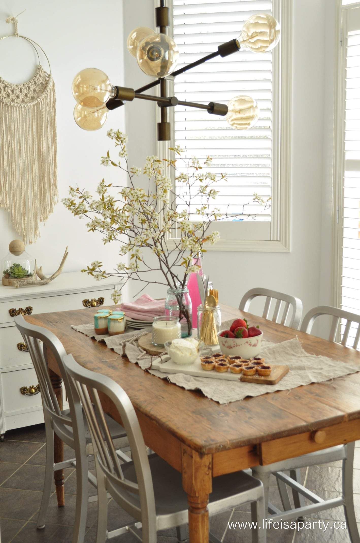
I also refinished the kitchen table. It’s an antique family piece, and I love it. It sees a lot of action from family dinners to craft sessions. Its finish was wearing off and it had serval colours of glitter embedded in it.

I stripped it and resealed it. It already has a scratch on the new finish…we’ll call it rustic.
The star of the show in here has to be my new light from Wayfair.

I love the juxtaposition of the modern light and the rustic antique table. Scandinavian design is great at adding a little modern.

The finish is an oil rubbed bronze and it has slightly bronze Edison style bulbs. It’s so beautiful at night.

And on the back wall, I took down my antique chalkboard, and added another pretty DIY macrame piece. I like that it echoes the brass and adds a bit of a more modern vibe.

The little cupboard that houses all the dog’s supplies stayed, and I like that it repeats the brass again with its handles.

I just love how the kitchen turned out. It’s simple and pretty and the perfect backdrop for entertaining and photographing parties for the blog.

And the living room is great too. I’m the type of person who takes a while to warm up to new things, but I have to say that each day I love it even more than the day before. I’m so glad I did it, and so glad to have partnered with some amazing brands to make it possible.
Sponsors:
A HUGE thank you to my sponsors. It was amazing to work with each one of them and showcase their beautiful products!
Disclosure: Some of the products in this post were sponsored. I received product from Home Depot, Afloral, Wayfair, Artizan Home, Fringe Market, Para Paint, Letter Board Company, Fusion Paint, and Northern Edge Prints. All opinions, as always are my own. Thanks for supporting the brands that make Life is a Party possible.

Source List:
Rug: Home Depot -Carlsbad Area Rug in grey, 8 x 10 (available in-store)
Light: Wayfair -Wunsch 6-Light Cascade Pendant
Paint: Para -Colour JoJo Whitewash
Chunky Wool Throw Blanket: Artizen Home -Large Throw, colour "On The Lam"
Accessories: Afloral -Large Cloche, Small Cloches, Faux Succulents, Grey Mongolian Lamb Fur Pillow, Grey Mongolian Lamb Fur Throw, Wood Slabs, White Wood Tray, Terirrums -Cubes, Pentagon
Macrame Cord and Fringe for DIY Pillows: Fringe Market -Cord -Fringe
Shiplap Installation: Benjamin Wood Works
Letter Board: Letter Board Company -16 x 20 Chatterbox
Paint for T.V. Unit Makeover: Fusion Mineral Paint -Casement
Art Prints: Northern Edge Prints, Forest Print and Log Rings Print
Be sure to check out all the other One Room Challenge Reveals and get inspired for your next make over project.
With a finished Rustic Scandinavian Living Room and Eating Area, life really is a party!


dnr says
Nicki, Thanks so much for your sweet words! I really appreciate it.
Dannyelle
dnr says
Thanks Casey, I love the brightness now too.
Dannyelle
dnr says
Kristi, thanks so much. I love the white too. It's so much brighter in here.
Dannyelle
dnr says
Erin, thanks so much for your sweet comment.
Dannyelle
dnr says
Thalita, thanks so much. You'll have to come back and see it in person. And you so should try macrame, it's really easy.
Dannyelle
dnr says
Sara, thanks so much. So glad you like it.
Dannyelle
Nicki Parrish says
I absolutely love this space! It is one of my favorite spaces for the ORC that I have seen so far. Great job. I have discovered your blog through the ORC and I will be following from now on!
Casey says
What a gorgeous space - and that table is fantastic! I love how bright everything is 🙂
Kristi Mercer says
Everything looks SO bright + airy! I adore all the white with a few natural elements mixed in and I am head over heels in love with those painted tree stump side tables!!! SUCH lovely spaces!!!
Erin says
This is FANTASTIC!! I love every single detail you have included... I just want to sit in that room and stare at everything!!!
Thalita @ The Learner Observer says
What an incredible transformation!!! The macrame, the stag horn ferns, the shiplap... it's all just lovely! You really brightened up the space but kept it so warm and inviting! Now I'm off to check out that bunting tutorial. I need to try this!
sara s syrett says
Your fireplace is my favorite! Love the transformation! That macrame hanging is perfect!! Love the dining space too! Well, love it all!
dnr says
Thanks Jessica, you're so sweet. I so appreciate your kind comments.
Dannyelle
dnr says
Jessica,
Thanks so much.
Dannyelle
Jessica | Petal + Ply says
Good golly, I LOVE your space(s)!! Bright clean white wood brass...love it all!